The sad news of Kate Spade’s passing this last week brought back memories of the logomark and pattern that represented Kate’s brand for many years.
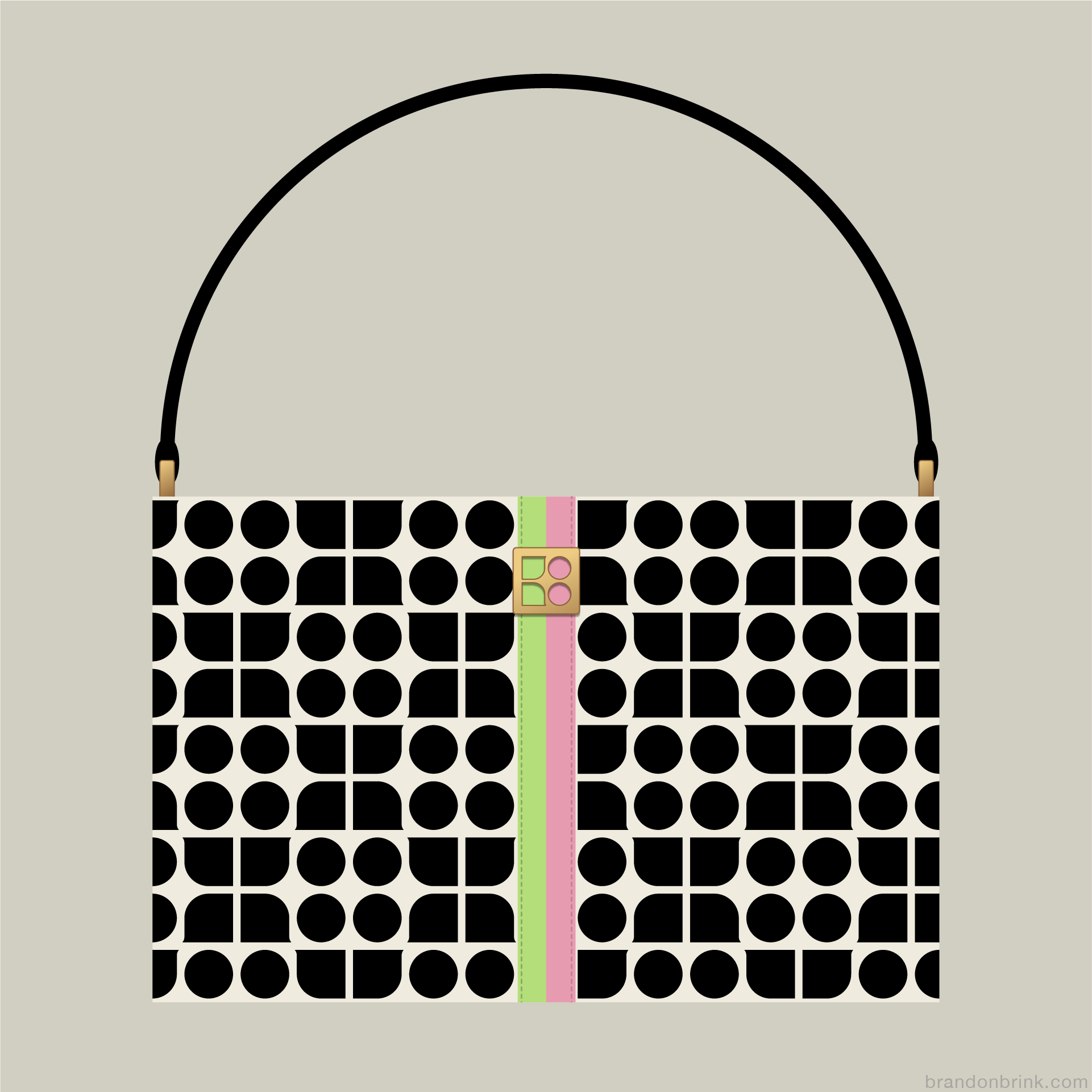
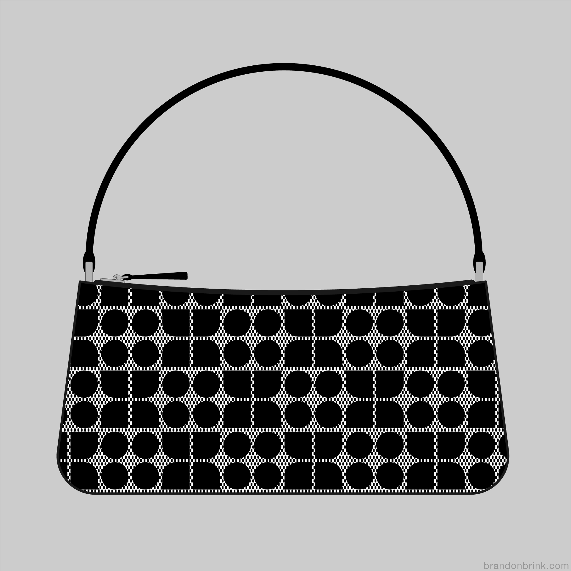
Kate Spade had an effortless classic style that was simple, fun, colorful, and bold. Kate started as a magazine editor in New York and after several years made a career change launching a handbag startup out of her apartment attic that would turn into an iconic fashion brand. Kate Spade had a very distinct, graphic logomark based on her initials which distills the letter forms of K and S down to minimal shapes of whole and quarter circles with a tiny curved flair on the arcs to echo the circles of the ‘S.’ The logomark was used as a bold, graphic monogram pattern on bags throughout her collections and was referred to as “Dot Noel,” after her middle name.
Searching for an image of one of Kate Spade’s first iconic iterations of the Dot Noel monogram pattern proved to be difficult, only finding very small images or photos in someone’s closet from a very fragmented handbag reselling market. It’s even hard to find information about the graphic designer she collaborated with to create the pattern with so many handbag listings in the internet.
So what was a failed image search to make a post about her passing, turned into into an illustration project, creating a stylized illustration of that iconic handbag from piecing together various lo-fi references from the web. One illustration quickly turned into a series of five Kate Spade monogrammed handbags to show the some of the many applications of the pattern (i.e. Black-on-black, quilted, woven, etc.).
Kate Spade’s monogram pattern was just one of the many facets of the design legacy she created. After being acquired by Coach, the ‘Dot Noel’ logomark was eventually changed to the quite literal nameshape of a Spade evolving into a symbol for the mass consumer market.
Rest In Peace, Kate...